LINEA
Web design, web development & digital strategy
Boutique Interior Architecture Studio
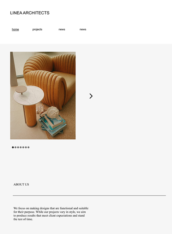
The original website for LINEA relied on rigid, templated layouts that felt dated, generic, and impersonal. Grey backdrops, small imagery, and uninspired text blocks undersold the creativity and professionalism of the practice. While the site provided functional information, it lacked the refinement and clarity needed to represent an architecture studio in a competitive market.

Web Design
Web Development
Digital Strategy
.png)
LINEA are an architecture & interior architecture studio, crafting interior spaces with architectural depth and emotional clarity. Every project begins with a deep respect for context—historical, cultural, spatial—allowing each environment to feel both grounded and quietly elevated. Their approach is rooted in the belief that good design is not just seen but felt. With a foundation in architecture and a sensitivity to material, form, and function, they create interiors that are both sculptural and deeply inhabitable.
LINEA are an architecture & interior architecture studio, crafting interior spaces with architectural depth and emotional clarity. Every project begins with a deep respect for context—historical, cultural, spatial—allowing each environment to feel both grounded and quietly elevated. Their approach is rooted in the belief that good design is not just seen but felt. With a foundation in architecture and a sensitivity to material, form, and function, we create interiors that are both sculptural and deeply inhabitable.
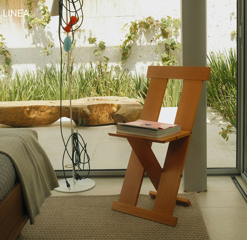
The redesigned page takes a more editorial approach, introducing a warm cream background, refined typography, and a balanced use of imagery and text. Full portraits, authentic photography, and carefully structured sections communicate not only who LINEA is, but also how the studio thinks and works.
The redesigned page takes a more editorial approach, introducing a warm cream background, refined typography, and a balanced use of imagery and text. Full portraits, authentic photography, and carefully structured sections communicate not only who LINEA is, but also how the studio thinks and works.
Home page

Full bleed wireframe
Refined typography, and a balanced use of imagery and text. Full portraits, authentic photography, and carefully structured sections communicate not only who LINEA is, but also how the studio thinks and works.
.png)
Refined typography, and a balanced use of imagery and text. Full portraits, authentic photography, and carefully structured sections communicate not only who LINEA is, but also how the studio thinks and works.
LINEA are an architecture & interior architecture studio, crafting interior spaces with architectural depth and emotional clarity. Every project begins with a deep respect for context—historical, cultural, spatial—allowing each environment to feel both grounded and quietly elevated. Their approach is rooted in the belief that good design is not just seen but felt. With a foundation in architecture and a sensitivity to material, form, and function, we create interiors that are both sculptural and deeply inhabitable.
LINEA are an architecture & interior architecture studio, crafting interior spaces with architectural depth and emotional clarity. Every project begins with a deep respect for context—historical, cultural, spatial—allowing each environment to feel both grounded and quietly elevated. Their approach is rooted in the belief
LINEA are an architecture & interior architecture studio, crafting interior spaces with architectural depth and emotional clarity. Every project begins with a deep respect for context—historical, cultural, spatial—allowing each environment to feel both grounded and quietly elevated. Their approach is rooted in the belief
Immersive mobile projects page

Mobile Journal

Case Study
The original website for LINEA relied on rigid, templated layouts that felt dated, generic, and impersonal. Grey backdrops, small imagery, and uninspired text blocks undersold the creativity and professionalism of the practice. While the site provided functional information, it lacked the refinement and clarity needed to represent an architecture studio in a competitive market. First impressions felt flat, failing to capture the sophistication and intentionality at the heart of LINEA’s work.The redesigned site replaces this outdated framework with a bold, editorial-inspired aesthetic. Full-bleed imagery drives the design, immediately immersing visitors in the atmosphere and materiality of the studio’s projects.
White and cream backgrounds create a sense of warmth and calm, while refined typography and balanced layouts allow content to breathe. The result is a digital experience that feels curated, intentional, and aligned with the qualities clients expect from high-level architectural design.This overhaul does more than refresh aesthetics — it directly strengthens LINEA’s business potential. Research shows that 75% of users judge a company’s credibility based on website design, and 38% will disengage if a site appears unattractive or outdated. The new site positions LINEA as a practice that treats its own digital presence with the same care as its built work. A refined, immersive website builds trust, conveys professionalism, and increases the likelihood of winning new business by aligning perception with capability.
Overall, the transformation elevates LINEA from a generic online presence to a sophisticated, design-led platform. The new site communicates clarity, restraint, and refinement at every level, ensuring that prospective clients and collaborators experience the studio as thoughtful, professional, and credible from the very first click.
.png)
About Page
Individual Projects

Projects overview page